DocHolliday
Well-known member
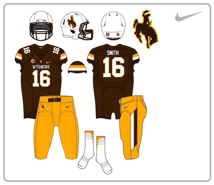
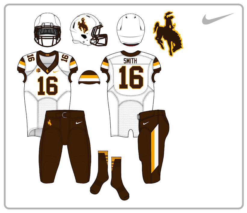
Yes or no to this concept: http://s248.photobucket.com/user/bohob_4_life/media/NCAA%20Football%20Concepts/wyocowboys_fb_home.jpg.html" onclick="window.open(this.href);return false;
calpoke25 said:No to home white pants.
Fullback41 said:on another note, I loved the helmets this year.
Wyokie said:Fullback41 said:on another note, I loved the helmets this year.
Me too. Reminds me of the Roach/Tiller Era.
LanderPoke said:No camo, no pink, and no yellow jerseys, please.
Your design is spectacular.wyopokes2 said:I would kill for them to go back to something like this concept I did awhile ago.


wyopokes2 said:I would kill for them to go back to something like this concept I did awhile ago.


laxwyo said:Stripes on the helmet are ugly
These are horrible. Have seen much better designs from posters on here.DocHolliday said:Yes or no to this concept: http://s248.photobucket.com/user/bohob_4_life/media/NCAA%20Football%20Concepts/wyocowboys_fb_home.jpg.html" onclick="window.open(this.href);return false;
