• Hi Guest, want to participate in the discussions, keep track of read/unread posts and more? Create your free account and increase the benefits of your WyoNation.com experience today!

How my Cowboys would look ;)

wyopokes2

Well-known member
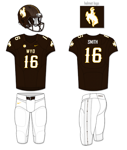
Hey guys, freshly inspired by a new template and the Pokes uni's this last weekend, I decided to make a new combo maker with some of my concepts. I wanted to add a modern yet western number font. I'm prepping to do a Wyoming state flag uniform/helmet which I will add to this later, but for now I was just laying the foundation. Here's my take on the pokes. Here's the link to the combo maker.

Here's my favorite combos from it:

1322033456998.png

1322033621917.png
 
Not a fan of the barbed wire, but the font you used on the jerseys is cool.. I like the "western" looking fonts, I'm not sure why the AD doesn't use that more.
 
I think we need a better pants design, I like the Cowboys on Brown but the other colors the legs are just plain. Watching different teams over the last few weeks I think the Brown and Gold would look pretty amazing with Baylors pants design.
 
I like em, but it's more of a historical love for them. I don't think I would like to see the cowboys of 2011/12 jump into them. too 80's looking, but you could tweak it up to get it looking more 2012.
 
Anything beats the "prairie gold" we wore in the early 2000's.

But to be honest, as much as we fans love our uniforms and colors I think that they hurt us on the recruiting front. It's silly that school colors & uniforms would even be part of an athlete's decision on a school, but it is. Brown & Gold just isn't very appealing to a kid in high school in CA, TX, etc.

I think this year's uniforms are the best I've ever seen. They don't stray too far from tradition, yet probably won't make the top 3 in ugliest unis in a new SI.
 
wyosteelerfan said:
lol @ that pic being from a sports illustrated article about ugly uniforms :rofl:


College Football's Worst Uniforms

I also love how the #1 ugliest Uniform was Oregon during that time and now they have what people consider to be the best looking uniforms. While Wyoming was the #2 ugliest and now we are considered to have one of the best new uniforms.

http://www.complex.com/sports/2011/09/the-20-best-new-college-football-uniforms-this-year#3
 
I to think that our current choices of unis are great. Especially since they put the gold steamboat on the matte brown helmet. I know a lot of people didn't think steamboat would standout as much when it was just an outline.

I hate "cowboys" down the pants is about all. The rest are fantastic.
 
SLCPoke said:
Wyo2dal said:
Someone tell me how BYU of all schools get a nod for one of the top 25 uniforms of 2011.


Where do you see that?!!

http://bleacherreport.com/articles/883727-less-is-more-college-footballs-top-25-uniforms/page/24

Their niche: The "Y" in the oval

For a team called BYU, it's interesting that they choose "Y" to be the only letter present on their helmet.

That's drawn enough attention to BYU's uniform to earn it an award.

Other than that, you've got to love the simple combination of navy blue and white.
 

Latest posts

Back
Top