Didn't the Cowboy wrestling team do a poster like this last year?
-
Hi Guest, want to participate in the discussions, keep track of read/unread posts and more? Create your free account and increase the benefits of your WyoNation.com experience today!
You are using an out of date browser. It may not display this or other websites correctly.
You should upgrade or use an alternative browser.
You should upgrade or use an alternative browser.
2013 Schedule Poster
- Thread starter Bryoming
- Start date
fromolwyoming said:Last I checked, they're not the ones out on the field getting beat up every week.Wyokie said:PokeTransplant said:laxwyo said:That poster sucks
Alternative?
How about the cheerleader girls in bikinis?
No but it'll look a whole nicer on your wall.
If we were 13 year old teenagers.
SLCPoke
Well-known member
PokeTransplant said:This poster kicks ass! Brett as the gunslinger and his deputies.
Would have been sweet to throw some Sheriff stars on them!
That is one awful poster but hey to each their own. I have no plans to put that up in my house/office and it very well may force me to design an official WyoNation schedule poster in the summer.
I do like the old western font though. Very similar to the font used on the basketball uniforms, I think this font should be adopted by the entire athletic department.
I do like the old western font though. Very similar to the font used on the basketball uniforms, I think this font should be adopted by the entire athletic department.
The font is designed by the athletic department, if memory serves correct.. at least, that's what someone told me.
OrediggerPoke
Well-known member
These posters are decent IMO and the Teton background is awesome! I probably would have left the guns and holsters out as it just reminds me of young kids playing cowboys and indians.
...it could be much much worse, have you guys seen Idaho's posters over the past few years????
...it could be much much worse, have you guys seen Idaho's posters over the past few years????
fromolwyoming
Well-known member
No, but did see SDSU's. They don't even show their player's faces.OrediggerPoke said:These posters are decent IMO and the Teton background is awesome! I probably would have left the guns and holsters out as it just reminds me of young kids playing cowboys and indians.
...it could be much much worse, have you guys seen Idaho's posters over the past few years????
wyopokes2
Well-known member
jarhead said:Personally, I like the look of the pic on Cuttslam's posts of Brett. Why couldn't they have done something like that using action shots of all of the players on this poster? I just think it could have been done much more classy than it is.
Thanks mate! The one in Cuttslam's sig was done by your's truly. I did do a schedule wallpaper for a background on my computer if you are interested.

Nice work! What program do you use for your edits? I might have to hit you up when my son gets on the field. I shoot a lot of pics but I am kinda a novice. LOL https://www.facebook.com/photo.php?...3_4564461878214_1595762739_n.jpg&size=827,960
wyopokes2
Well-known member
jarhead said:Nice work! What program do you use for your edits? I might have to hit you up when my son gets on the field. I shoot a lot of pics but I am kinda a novice. LOL https://www.facebook.com/photo.php?...3_4564461878214_1595762739_n.jpg&size=827,960
I mostly use Photoshop for the pictures and putting everything together, but the typography and logos are done in Illustrator.
") If you ever need help don't be afraid to hit me up.
If you ever need help don't be afraid to hit me up.J-Rod
Well-known member
No...they were all oiled up.laxwyo said:I guess it's at least not idaho's from a few years ago. Weren't they the ones all shirtless with battle axes and chains?

Cuttslam
Well-known member
Kudos to you sir, it is BADASSS.wyopokes2 said:jarhead said:Personally, I like the look of the pic on Cuttslam's posts of Brett. Why couldn't they have done something like that using action shots of all of the players on this poster? I just think it could have been done much more classy than it is.
Thanks mate! The one in Cuttslam's sig was done by your's truly. I did do a schedule wallpaper for a background on my computer if you are interested.

WYO1016 said:Sorry I don't have a bigger image, but this was just posted on twitter. Much better than last year's giant helmets version, in my opinion.
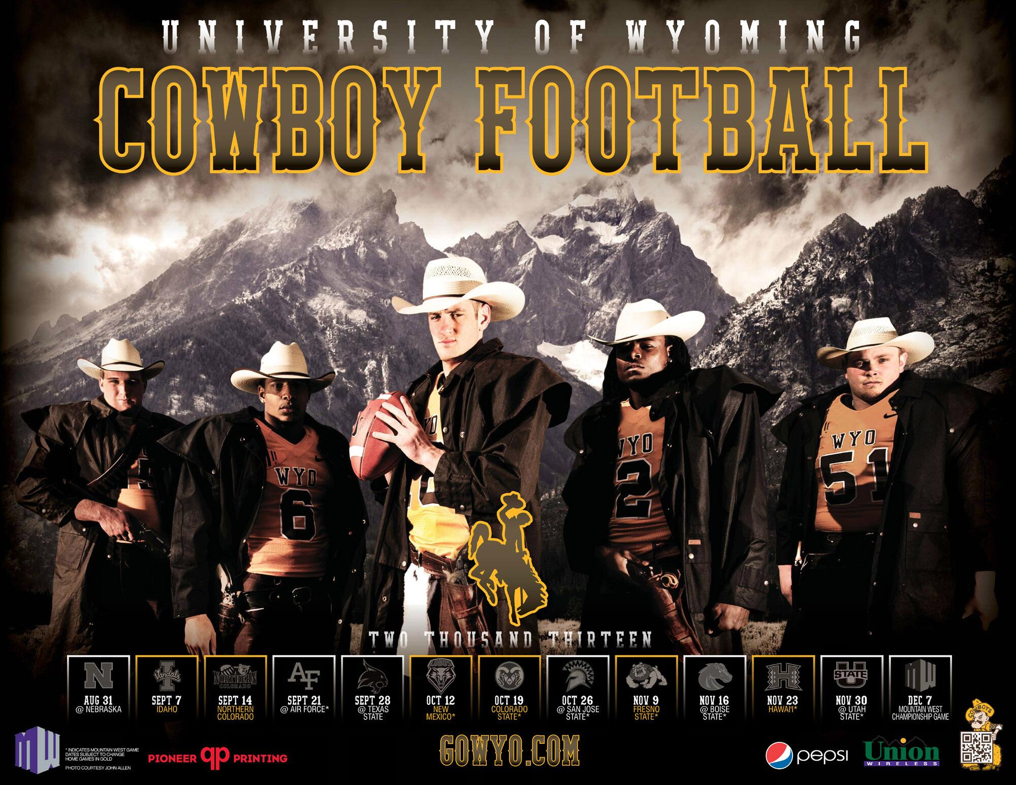
Looks damned good to me. Maybe I've lived in Laramie too long and haven't seen the Tetons for a while.
Posters don't matter - we are Wyoming Cowboys - its time to get out there and make some noise. This represents the brand and a national park. Go Pokes!