

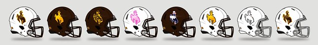
So a few months ago a friend of mine named Brian Gundell, who has a graphic design company in Oregon,approached me about a plan to do a rebrand for the University of Wyoming. A couple weeks ago he presented it to the University to try to get the ball moving. However licensing struck it down before it ever really had a chance. I wanted to post it for you guys to discuss what could have been. I really am in love with the secondary skull logo. Here's the link to the presentation file:
http://issuu.com/briangundell/docs/wyom ... esentation
He also did an Air Force rebrand awhile ago that you might wanna check out
http://briangundell.com/Air-Force-Athle ... d-Proposal
2012 Wyoming Rebrand Proposal
Interesting. So he gave Steamboat a similar upgrade to what the Detroit Lions did with their logo.
While I don't think it will ever happen, this is probably the only kind of logo change UW would ever see.
While I don't think it will ever happen, this is probably the only kind of logo change UW would ever see.
-
castlerocker
- Cowpoke
- Posts: 563
- Joined: Sat Aug 28, 2010 8:56 pm
You could try to sell that skull to Texas Longhorns dude!
-
MrTitleist

- WyoNation Overlord
- Posts: 10524
- Joined: Sun Aug 12, 2007 2:46 pm
- Location: Missoula, MT
- Has liked: 8 times
- Been liked: 34 times
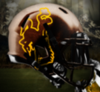
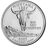
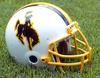
Tweaking Steamboat would have some serious ramifications statewide. If Okie wasn't traveling right now he'd be telling us how you don't change the best logo in college football. I would probably agree with him for once.  I personally didn't care for the Steamboat tweaks.. too pointy. The skull I would be okay with.. the skull should really be a buffalo skull rather than what looks like a cow skull. Utah State has a similar looking skull as a secondary logo. I did like the new word mark and I can definitely see some value to some of the work he did. The last time UW tried a new secondary logo it was basically a dumpster fire. The color rebrand didn't help either. I see a lot of good things that your friend did, and I see some stuff that would be cause for riots in Wyoming.. like changing Steamboat. But seriously, if the Pokes ever came out of the tunnel wearing anything but the horse on the helmet, there would be Morgantown style couch burning. I really enjoyed looking at his design though. The AFA redesign was totally awesome.. that falcon was sharp.


-
wyopokesfan23
- Ranch Hand
- Posts: 261
- Joined: Mon Aug 13, 2007 12:58 am
I really like the court and field, and the uniforms looked sharp. I wasn't a fan of the new steamboat but seeing it next to the current one did make me think I would like some tweaks, because the new one does look a lot "tougher." Maybe somewhere in the middle. I also like the idea of adding a ponytail to the girls logo.
-
laxwyo
- Bronco-Buster
- Posts: 9506
- Joined: Sat Jan 23, 2010 10:27 am
- Location: Rock Springs, WY
- Has liked: 137 times
- Been liked: 151 times
I didn't know there was many chicks saddle bronc riding.wyopokesfan23 wrote:I really like the court and field, and the uniforms looked sharp. I wasn't a fan of the new steamboat but seeing it next to the current one did make me think I would like some tweaks, because the new one does look a lot "tougher." Maybe somewhere in the middle. I also like the idea of adding a ponytail to the girls logo.
W-Y, Until I Die!
-
Wyo2dal
- Bronco-Buster
- Posts: 7392
- Joined: Sat Sep 01, 2007 12:36 pm
- Location: Dome of Doom
- Been liked: 1 time
I'm a fan of the secondary logo but agreed should be a buffalo but it would be welcomed. However we know that the only thing that will ever change for Wyoming is possibly shades of the color and that is it.
-
wyopokesfan23
- Ranch Hand
- Posts: 261
- Joined: Mon Aug 13, 2007 12:58 am
Buffalo and cow skulls really aren't too different, and this logo looks like a buffalo skull to me. I like the subtle shot at the hippies up north of having a DEAD buffalo as a secondary logo.Wyo2dal wrote:I'm a fan of the secondary logo but agreed should be a buffalo but it would be welcomed. However we know that the only thing that will ever change for Wyoming is possibly shades of the color and that is it.
-
kansasCowboy

- WyoNation Addict
- Posts: 2365
- Joined: Wed Jun 09, 2010 2:42 pm
I honestly didn't like either. Steamboat needs no tweaking. Their is no reason to change what works. It just seemed like a broader horse with a fatter Cowboy riding on it to me. Keep Steamboat the same. The skull really makes no sense. I was looking at the the pic of the field with the skulls on it and it just seems well out of place. Maybe for t shirts or something like that, but not uniform or field. I did like the sideline decals for the basketball court and surrounded the wording. That really seemed nice and looks like something that could be pulled off.
-
djm19

- WyoNation Addict
- Posts: 3002
- Joined: Wed Aug 03, 2011 2:34 pm
- Location: UT
- Has liked: 1 time
- Been liked: 3 times
I'm always good seeing some iterations and some concepts of the steamboat....however, I, too would ne rioting if the original steamboat went away. That logo is not just about UW. It is probably one of the most synonymous logos representing the state. Name one other state where that logo is their college, license plates, hwy signs, currency, etc. It is branded everywhere. One little tweak and it is different. I'm all about an ad campaign that incorporates a promo "look" but the logo has to remain the original. Add a typeface below it, add some color options, but the Steamboat logo must remain untouched. Changing that would be like replacing a cheddarwurst with a tofu wrap on the maverik cookers....just not American.
I totally agree that steamboat will and should never change. One thing that was mentioned but probably a little overlooked is the wordmarks and typeface. Doing a lot of the advertisements the AD puts out myself, it's tough not having one. Look at most college programs and they have an easily identifiable wordmark. Wyoming just typically uses a block font that can vary from item to item. That to me was one of the things that really intrigued me. I liked the WYO marks a lot. The field and court were pretty cool. I think the football uniform with the wooden numbers and barbed wire was neat. I love the basketball unis too. That's one thing that I think would be really good for Wyoming. Uniforms that custom made for UW like the bigger programs. That requires money though and as we all know sports uniforms was one of the things on the budget cut list.
-
307Realist
- Buckaroo
- Posts: 11
- Joined: Sat Aug 06, 2011 7:57 am
The new steamboat looks cool, but I agree with you all that there's no need to change it. Not sure what I think of the buffalo head. The wordmarks were cool and I agree with wyopokes2 that UW needs a consistent and easily recognizable wordmark. The basketball and volleyball uniforms looked great.
-
fromolwyoming

- WyoNation Lifer
- Posts: 12832
- Joined: Sat Nov 28, 2009 11:13 pm
- Location: Laramie, Home of the Cowboys
- Has liked: 1 time
- Been liked: 2 times
The "new" Steamboat just seemed more curly or pointy or something and a bit wider, so ne real need to change that. And like what was said already, Steamboat as is, does more than represent UW, it is the state symbol in many things.
The Buffalo Skull helmet was interesting, and would look pretty cool as like a Pro Combat uniform, but should NEVER replace Steamboat as THE logo. And it really did not work for the football field either. Though, it looked pretty cool for the basketball court.
I liked the barbed wire on the unis, (something that we all wished were on the Brown pants rather than "Wyoming"), and the unis in general looked okay.
But overall, it was alright and gives some new insight to Wyoming's brand.
-
WYO1016
- WyoNation Addict
- Posts: 4426
- Joined: Mon Aug 13, 2007 9:11 am
- Location: Cheyenne, WY
- Has liked: 38 times
- Been liked: 110 times
I'm not a fan of changing Steamboat or the buffalo skull, personally. The wordmarks looked great, and I agree that the colors need to be standardized across the board. (Anyone remember when we wore gold jerseys over gold pants last season and they were different shades? Embarrassing.) DO NOT get rid of Pistol Pete for our secondary mark! We fought hard to keep that when okie state wanted to take it from us.
-
wyocowboy2014
- A Real Cowboy
- Posts: 1110
- Joined: Mon Aug 08, 2011 6:24 pm
- Location: WY
- Been liked: 1 time
If our defense would ever be good enough I think the buffalo skull would be a cool logo for them similar to the blackshirts.

-
Wyokie
- WyoNation Moderator
- Posts: 6685
- Joined: Sun Aug 12, 2007 5:40 pm
- Location: Oklahoma City but from Casper, WY
- Has liked: 36 times
- Been liked: 46 times
I'm back from Wyoming.
NEVER EVER CHANGE THE GREATEST LOGO EVER!!!!!!!!!!!!!!!!!!!!!!!!!!!
BTW, I-25 in Colorado is a royal bitch.
NEVER EVER CHANGE THE GREATEST LOGO EVER!!!!!!!!!!!!!!!!!!!!!!!!!!!
BTW, I-25 in Colorado is a royal bitch.
I want CHAMPIONSHIPS not chicken poop! And we're getting chicken poop!!!!!!!!!!!